I am pleased to announce that Lingopolo is now mobile friendly.
In the not so distant past, if you tried to use Lingopolo on a mobile device, this is what it would look like:
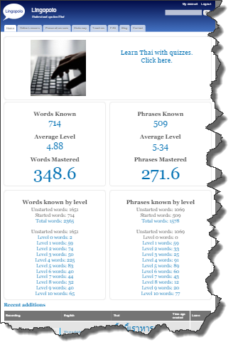
Yes, it was microscopically tiny text.
Sure, you could pinch to expand to make things legible. But then every time you clicked on a link, the page would reset itself to exactly the same format. And so you would have to pinch and stretch the page again to view it. Every time. Click. Pinch to see the text.
It wasn't very mobile friendly!
I would never use it myself on a mobile device for that reason. I did get rather shocked though when I saw in the logs that some people were visiting many pages on mobile devices like the iPhone.
Finally I have made the time to make Lingopolo mobile friendly.
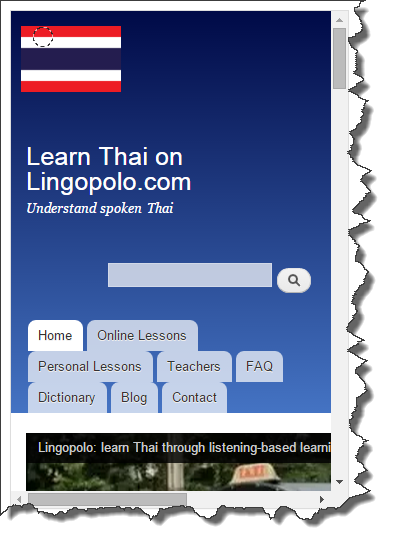
The first step was to make the text display in a sensible size. This was done, but the following screenshot shows there were still big problems: the header took up a huge amount of the screen; the logo, site heading, search button each overlapped onto a new line; the menu tabs looked a mess and took up a huge amount of screen space. Still not very mobile friendly, but at least the text was readable!
Now, however, things have changed. The pages are fully responsive to whatever screen size they are on.
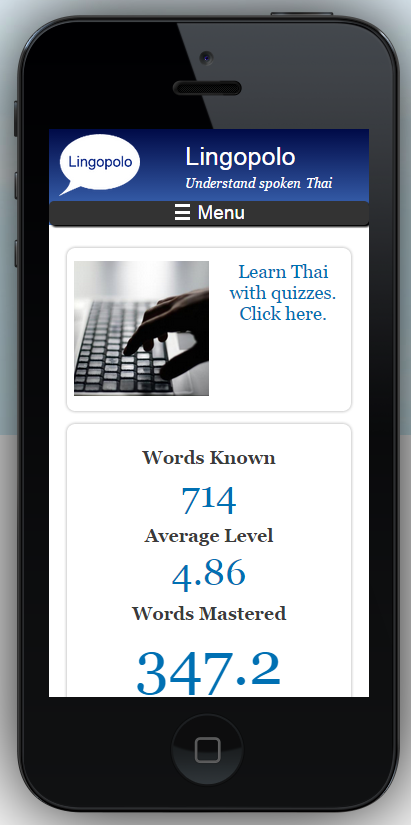
The following shows the home page as it now displays on the iPhone 5.
Notice the following changes:
- Firstly, and most obviously, the text is a readable size.
- The menu tabs have disappeared and have been replaced by the word "Menu" and the 3-stripes icon known as the hamburger icon.
- The search box has disappeared into the Menu bar
- The text "My account" and "Log out", which normally appear in the top right of the screen, have also disappeared into the Menu
- The Lingopolo logo and "Lingopolo, Understand spoken Thai" display nicely together (the flag has been replaced by the Lingopolo icon, but that is not related)
- The general height of the whole heading section has been drastically reduced
- The "Words Known" box only takes one column
- Another change, though not visible in the screenshot below, is that the YouTube intro video is not shown on the mobile screens
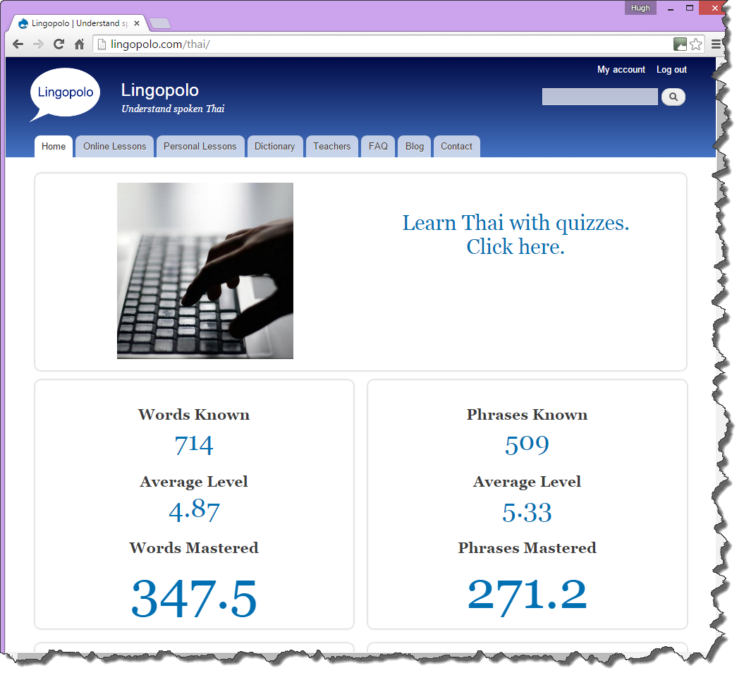
Compare that with how the screen looks on a desktop computer:
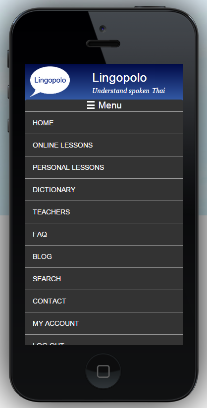
When a user clicks on the "Menu" bar they get to see all the options previously available:
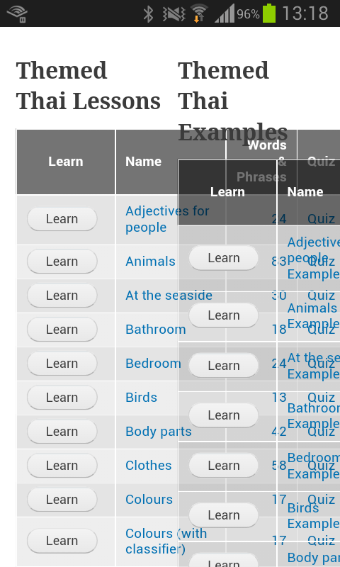
Another problem on mobile was the tables on the Online Lessons page overlapping, the following taken on my Samsung GT-I8190, so still not exactly friendly:
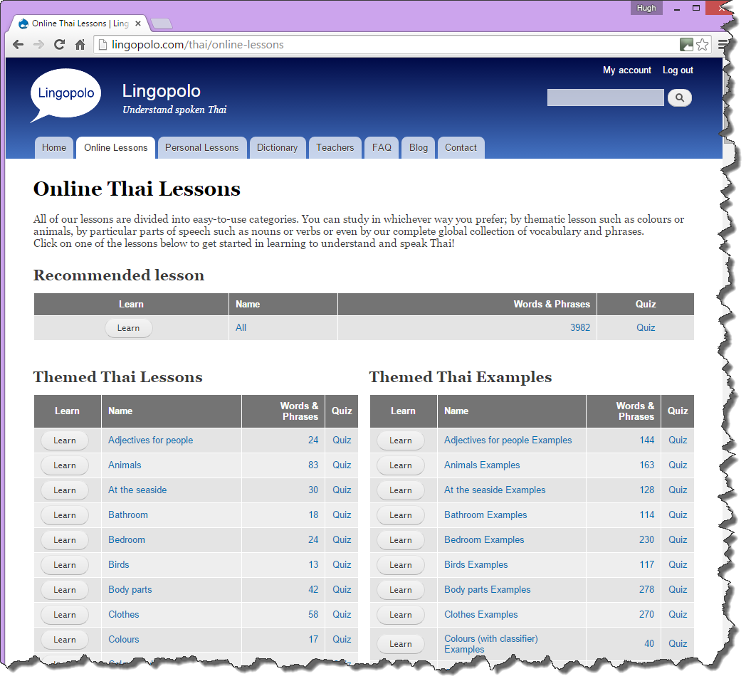
This is how that page looked like on a desktop computer:
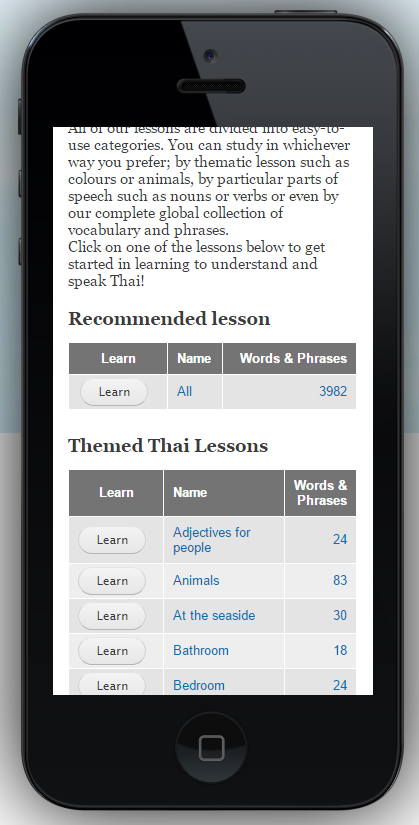
Now, however the Online Lessons page is perfectly readable on a mobile device. Below is how it now looks on an iPhone 5:
Another subtle change is in the quiz results page. Firstly, look at how it appears on a desktop display:
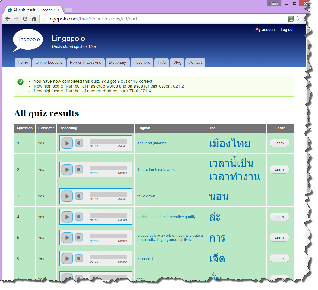
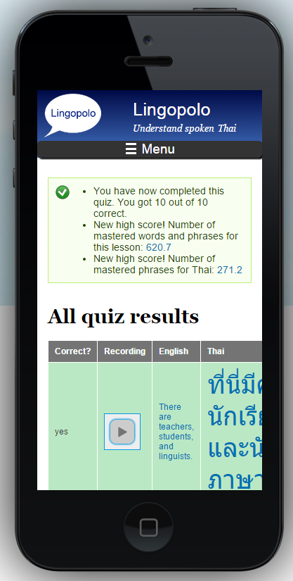
On a mobile device, there are few subtle changes:
- the "Question" number column on the quiz results page is removed completely
- the play button changes from fully-featured (with stop button, and a timer) to simply a play button
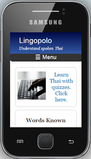
One of the final challenges was to get Lingopolo to be usable even on the very smallest of devices. The following picture shows how Lingopolo looks on a Samsung Galaxy Y, whose screen resolution is a mere 240 x 320 pixels. You will see at this size of screen even the logo disappears.
Overall Lingopolo is now pretty mobile friendly. I commend it to your use for studying Thai on the go!
